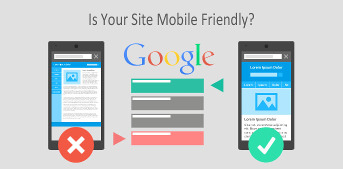
There are already a ton of posts out there talking about the new Google Mobile-Friendly update which is going live on April 21, 2015. If you want to read full details on this update you can check it out on the official Google Webmaster Blog. What I want to discuss in this post is what does this mean and what your options are to meet the new mobile-friendly requirements.
So what does this update mean?
This new update is going to have a huge impact on any website that relies on mobile organic search and mobile ads. This is not going to impacts your overall SEO from a PC search perspective. Bottom line, if more than 10% of your traffic is coming from mobile devices, then you should get your site updated to be mobile friendly. If only 1% of your traffic or potential traffic are mobile users, then you probably don’t have to freak out just yet. Although, I wouldn’t be surprised if Google eventually factors this into all search and not just mobile search.
What does mobile-friendly mean?
Having your website mobile-friendly is a very vague term. Although the direct definition just means, does your website look good on a mobile device? The practical application can mean different things because there is more than one way to make a website mobile-friendly, so which is the best method to choose?. According to Google, there are three methods of making a site mobile-friendly, but in reality there are four methods:
Responsive Web Design
Responsive design is when your website layout changes to automatically fit into the size of a users screen. This is accomplished through the use of CSS and HTML which uses percentage based width settings instead of traditional fixed width settings. You can tell a site is responsive if you open it on a computer in full screen, then as you change the size of the browser window you will see the website changing to fit into the screen.
- The benefit of using a responsive design is you have one code base to manage, so if you make an update on any page of your website, it will automatically update the mobile version of the site, because it is one and the same code base.
- The drawback of responsive design are two issues: (1) It is usually more work, therefore more expensive, to design a site to be responsive. This might not be the case if you purchase an existing theme, but if you build a site from scratch then this is usually the case. (2) A responsive site typically loads slow on a mobile device because all of the same content which usually renders on a full size site still needs to load onto a much smaller screen.
Dynamic Serving (aka Adaptive)
Dynamic Service, also known as Adaptive design, refers to the process of serving up a different code base at the server level, whenever a site is displayed on a different device. Unlike responsive, which kicks in once the website loads, an Adaptive site triggers at the server level once the site is requested to display. An Adaptive site usually has multiple break points, which means the site will look one way at full width, then as a user shrinks the screen size (or changes devices) the website will all of a sudden change once it hits a break point. Typically there are 5 break points (i.e. mobile vertical, mobile horizontal, tablet vertical, table horizontal and full width) but technically you can have as many as you want to fit all of the different screen sizes that exist. On the other hand, you can technically just have two break points, one for full view and one for mobile.
- The benefit for Adaptive design is you can completely control the look and feel of the site on different devices/screen sizes.
- Another benefit is load speed on mobile is usually fast since you can control what assets are served onto mobile devices.
- The drawback is you have a separate set of code for each break point that needs to be maintained. This means more work for setup and for long term maintenance.
Separate URLs (aka Mdot)
This is the original way of doing mobile sites, also referred to as Mdot. Similar to Dynamic Serving, the only real difference is the URL changes between the normal website for computers vs. the m.domain.com which displays for mobile devices. Today, there are a ton of third party tools that will basically scrape your normal website to help you generate a Mdot version of your site with no coding required, but you do have to pay a small monthly fee.
- The benefit for Mdot is the same as Adaptive in the sense that you can completely control the look and feel of the site on different devices/screen sizes.
- Another benefit is load speed on mobile is usually fast since you can control what assets are served onto mobile devices.
- The drawback is you have a separate set of code for each break point that needs to be maintained. This means more work for setup and for long term maintenance.
- An additional drawback is the negative SEO impact in having two URLs instead of one. Today the SEO penalty is relatively small, but it is expected to grow.
Hybrid of Adaptive and Responsive
This is the fourth method which Google does not classify, but it does exist and in my opinion it is the best option to go with if you have the budget and resources. If not, then go with Adaptive. Using a hybrid method is exactly what it sounds like, you would still have 2 – 3 break points using Adaptive, but to ensure your site looks as nice as possible on all screen and device types you would use responsive to fill in the gaps between the break points. Basically the site would act like a normal responsive site, but as you hit different break points you would hide different elements at the server level from ever showing to optimize the site load speed and improve the overall user experience.
- The benefit for using a hybrid method of Adaptive and Responsive design is you can completely control the look and feel of the site on different devices/screen sizes.
- Another benefit is load speed on mobile is usually fast since you can control what assets are served onto mobile devices.
- The drawback is you have a separate set of code for each break point that needs to be maintained. This means more work for setup and for long term maintenance.
- Another drawback is this method is typically a lot of work which means higher cost in development.
Personally, I always would recommend either a hybrid method or to use adaptive because mobile site performance (site speed) is always my #1 concern. Site speed is king because it impacts SEO as well as user experience. Studies have shown that a 1 second increase in load time can equal more than a 2% drop in conversions. If you cannot afford to do Adaptive or a hybrid method, then try to use a light weight responsive theme. Worst case scenario, use a Mdot method but I really only recommend doing so as a temporary solution while you are working on or saving up for a better solution. Make sure you are prepared to address the April 21, 2015 Google Mobile-Friendly Update.

- COVID-19 Has Forced Many Business To Ask, How Do I Start Selling Online? - May 25, 2020
- Applying AI Technology To Taco Bell - January 25, 2020
- ONWARD 2018 Taco Bell Brand Award - November 11, 2018

One Response
1parental
Comments are closed.